
If you are creating a YouTube video, choosing the right thumbnail size is one of those small details that can make a big difference. A thumbnail is often the first thing people notice before they decide whether to watch your video. You can have a great video title, useful information, and excellent editing, but if the thumbnail looks blurry, crowded, or poorly sized, people may simply scroll past it.
So, what is the best YouTube thumbnail size?
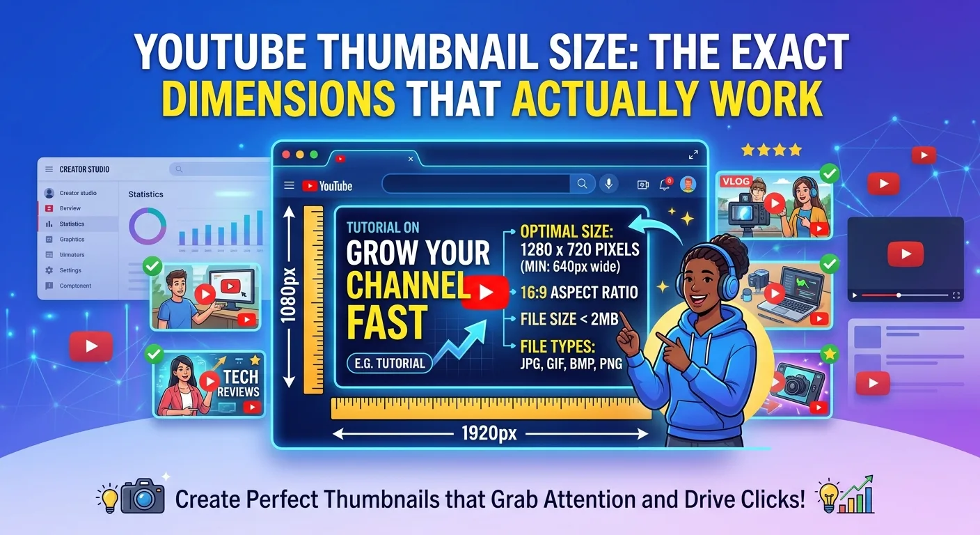
For most creators, 1280 × 720 pixels with a 16:9 aspect ratio is the standard size to work with. YouTube supports larger 16:9 images as well, and its current Help documentation recommends 3840 × 2160 pixels with a minimum width of 640 pixels.
But dimensions are only part of the story.
A good YouTube thumbnail also needs readable text, a clear subject, strong visual contrast, and a design that still makes sense when it becomes very small on a phone or search page.
In this guide, we will explain the exact YouTube thumbnail dimensions, file formats, aspect ratio, file size, design tips, common mistakes, and how to create a thumbnail that actually works.
What Is the Best YouTube Thumbnail Size?
The most commonly recommended working size for a standard YouTube video thumbnail is:
- Width: 1280 pixels
- Height: 720 pixels
- Aspect ratio: 16:9
- Minimum width: 640 pixels
- Recommended format: JPG or PNG
Google’s YouTube documentation recommends a 16:9 aspect ratio because it is the most commonly used format across YouTube players and previews.
For everyday thumbnail design, 1280 × 720 is a convenient choice because it provides enough resolution for a sharp image without making the design unnecessarily difficult to manage.
You can also create a thumbnail at 1920 × 1080 or another larger 16:9 resolution. However, the important thing is to maintain the correct aspect ratio and keep the final file within YouTube’s applicable upload limits.
Why Is 1280 × 720 So Popular?
You may wonder why so many designers use 1280 × 720 when YouTube’s current documentation supports higher resolutions.
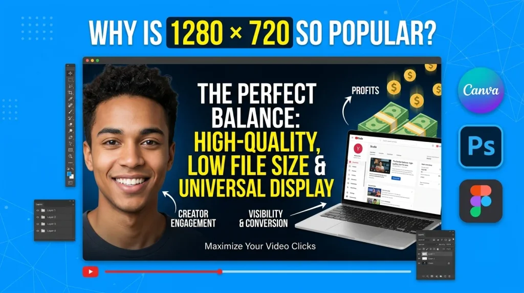
The answer is simple: 1280 × 720 is practical.
It provides a good balance between image quality, editing performance, and file size. It is also easy to set up in Canva, Photoshop, Figma, Photopea, and other graphic design tools.
At this size, you have enough space for:
- A main image
- A person’s face
- Large headline text
- Background graphics
- Branding
- Icons or objects
- Simple visual effects
The 16:9 ratio also matches the way standard YouTube videos are displayed.
For example, if your video is about making money online, you might use a person on one side, a laptop or money-related visual on the other side, and a short headline in the middle.
The thumbnail does not need to explain the entire video. Its job is to quickly communicate the main idea and make the viewer interested.
YouTube Thumbnail Aspect Ratio: Why 16:9 Matters
The 16:9 aspect ratio is one of the most important parts of YouTube thumbnail design.
It means the image is 16 units wide for every 9 units in height.
Common 16:9 sizes include:
- 1280 × 720
- 1920 × 1080
- 2560 × 1440
- 3840 × 2160
YouTube recommends using 16:9 for standard video thumbnails because it fits the platform’s video players and preview areas.
If you create a square image or use an unusual aspect ratio, your design may not look the way you intended in different areas of YouTube.
That is why it is better to start your design with the correct dimensions instead of trying to resize an unrelated image at the end.
What File Format Should a YouTube Thumbnail Use?
YouTube supports common image formats such as JPG, GIF, and PNG for custom thumbnails.
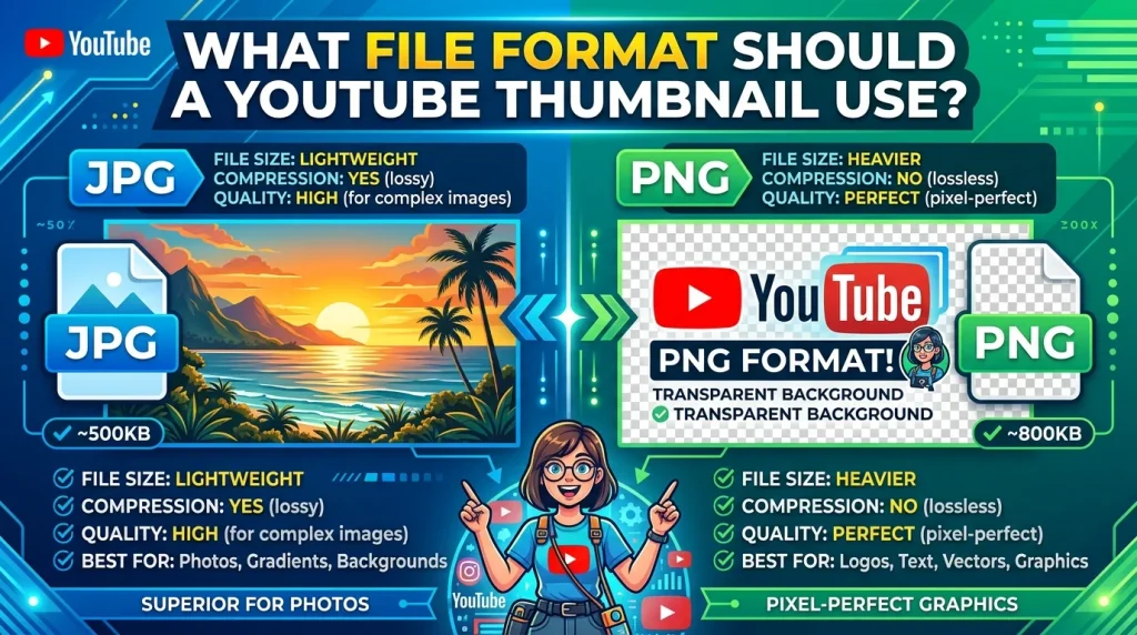
For most creators, JPG and PNG are the easiest options.
JPG
JPG is a good choice when your thumbnail contains photographs, backgrounds, people, or detailed images.
One advantage is that JPG files can usually be compressed to a smaller size while still looking good.
PNG
PNG is useful when your design contains sharp text, logos, illustrations, or graphics where you want clean edges.
However, PNG files can become much larger, especially when the thumbnail contains a detailed photograph.
If your image is too large to upload, exporting it as a high-quality JPG can often reduce the file size significantly.
What Is the Maximum YouTube Thumbnail File Size?
The file-size limit depends on the upload environment.
YouTube’s current Help documentation says mobile uploads have a 2 MB limit for video thumbnails, while desktop uploads can have a larger limit.
Because of this, keeping your thumbnail reasonably compressed is a good habit.
A thumbnail does not need to be an enormous file to look professional. A properly optimized JPG can look excellent while using considerably less storage.
If your thumbnail is rejected because of file size, try:
- Exporting it as a JPG.
- Reducing the image quality slightly.
- Removing unnecessary metadata.
- Using an image compression tool.
- Checking the final dimensions before uploading.
The goal is simple: high visual quality without unnecessary file size.
Read More: How to Convert a Scanned CNIC to PDF for Online Applications
Does a Bigger Thumbnail Mean Better Quality?
Not necessarily.
You can create a thumbnail at a much higher resolution, but YouTube will still display it at different sizes depending on where the viewer sees it.
YouTube’s developer documentation shows that video thumbnails can be available in several resolutions, with the maximum-resolution version reaching 1280 × 720 in its API documentation.
The important lesson is that you should not focus only on making the thumbnail extremely large.
Instead, focus on making it clear at small sizes.
A beautiful design that only looks good when you zoom in is not necessarily a good YouTube thumbnail.
Design Your Thumbnail for Mobile Users
This is one of the biggest mistakes new creators make.

They design the thumbnail on a large computer screen and think everything looks perfect. But many viewers encounter YouTube thumbnails at much smaller sizes.
When the thumbnail becomes small, tiny text disappears. Small objects become difficult to recognize. Complicated backgrounds become messy.
Recent thumbnail research and design guides emphasize testing thumbnails at smaller display sizes because the viewer rarely sees the original 1280 × 720 canvas at full size.
Before publishing your thumbnail, zoom out or preview it at a small size.
Ask yourself:
Can I understand the thumbnail in one or two seconds?
If the answer is no, simplify it.
How Much Text Should You Put on a YouTube Thumbnail?
One of the easiest ways to ruin a thumbnail is to add too much text.
Your thumbnail is not the place to write the entire video title.
Instead, use a short phrase that creates curiosity or communicates the main benefit.
For example, instead of:
“How to Create a Professional YouTube Thumbnail in Canva for Beginners”
you could use:
“CREATE BETTER THUMBNAILS”
Or:
“THIS CHANGES EVERYTHING”
Or:
“BEST THUMBNAIL SIZE?”
Short text is easier to read, especially on small screens. Recent thumbnail research recommends keeping the primary message short, with roughly three to five words often being a practical target.
There is no magic word count that guarantees clicks, but less text usually gives you more room to make the important words large.
Use Large and Easy-to-Read Fonts
Your thumbnail text should be readable without effort.
Avoid extremely thin fonts or decorative typefaces that become difficult to recognize when the image is small.
Bold fonts generally work better for thumbnail headlines because they remain visible when the design is reduced.
For example:
GOOD:
BIG, BOLD, SIMPLE TEXT
NOT IDEAL:
A long sentence written in a tiny decorative font
You should also create enough contrast between the text and its background.
If your background is dark, light text may be easier to read. If the background is bright, a darker text treatment may work better.
The exact colors depend on your brand and subject, but the main goal is always clear readability.
One Thumbnail Should Communicate One Main Idea
A common mistake is trying to put everything into one thumbnail.

A creator might add:
- Three people
- A laptop
- A phone
- Money
- Arrows
- Charts
- Five icons
- A large logo
- Ten words of text
- A complicated background
The result can look busy rather than professional.
Instead, choose one main idea.
If your video is about YouTube thumbnail size, for example, the thumbnail might show:
1280 × 720
with a simple YouTube-related visual.
The viewer immediately understands the topic.
Use Faces When They Make Sense
Faces can be powerful visual elements, especially when the expression matches the topic.
A surprised face can support a surprising claim. A happy expression can support a positive result. A confused expression can work for a problem-solving video.
But adding a face just because other creators do it is not necessary.
If your video is about a technical topic, an object, screenshot, number, or graphic may communicate the idea better.
The best thumbnail depends on the audience and subject.
YouTube itself recommends considering the target audience and using familiar features or emotions when appropriate. It also recommends keeping thumbnail designs from becoming overly complex and making text easy to read.
Keep Important Elements Away From the Corners
When designing a thumbnail, don’t place important information too close to the edges.
YouTube’s interface can place different elements over or around the thumbnail depending on where it appears.
For example, the video duration indicator can appear over part of the thumbnail.
This means you should avoid placing critical text or important visual details in areas where platform elements may interfere.
A simple rule is to keep your main headline and subject comfortably inside the central area of the design.
YouTube Thumbnail Size for Shorts
YouTube Shorts are different from standard horizontal YouTube videos.
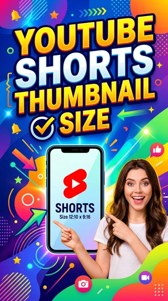
Standard video thumbnails are generally designed around a 16:9 horizontal format, while Shorts are vertical content.
YouTube’s Help documentation recommends a 9:16 aspect ratio for Shorts thumbnails.
This means you should not simply take a standard 1280 × 720 thumbnail and stretch it vertically.
Instead, create a design specifically for the format where it will appear.
YouTube Thumbnail Size for 4K Videos
Your video’s resolution does not mean your thumbnail has to use the same resolution.
For example, you might upload a 4K video but create your working thumbnail at 1280 × 720.
The thumbnail and video have different purposes.
The video resolution controls the quality of the video itself. The thumbnail is the preview image viewers see before clicking.
If you want to work at a larger resolution, a 3840 × 2160 canvas is also a 16:9 image, and YouTube’s current Help page lists that resolution as recommended for custom thumbnails.
For most creators, however, a clean 1280 × 720 design remains a simple and practical workflow.
How to Create a YouTube Thumbnail in Canva
Canva is one of the easiest tools for beginners who do not have advanced graphic design experience.
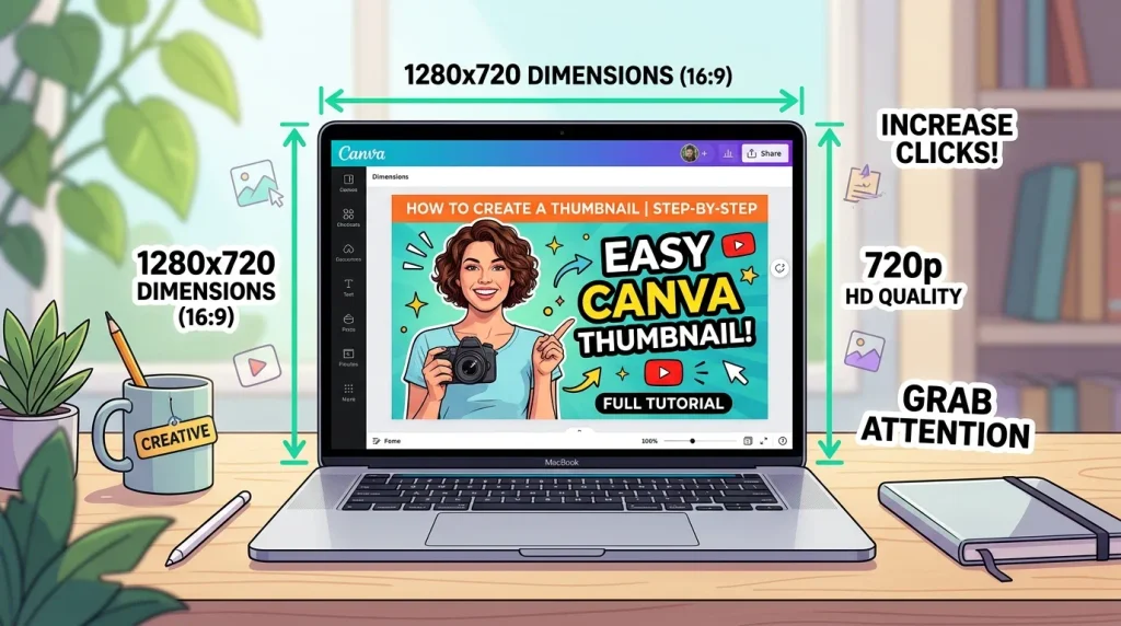
To create a thumbnail:
Step 1: Open Canva
Create a new custom-size design.
Step 2: Set the Dimensions
Use:
1280 × 720 pixels
This gives you the standard 16:9 working canvas.
Step 3: Choose a Clear Background
Use a high-quality image or simple background related to your video.
Avoid backgrounds that are so complicated that your text disappears.
Step 4: Add Your Main Subject
Place the main person, product, screenshot, or object where viewers can immediately see it.
Step 5: Add Short Text
Use a large, bold headline.
Try to communicate the main idea in only a few words.
Step 6: Check the Thumbnail at Small Size
Zoom out.
If the text becomes difficult to read, make it larger or shorten it.
Step 7: Export
Export the final design as JPG or PNG and make sure the file meets the applicable YouTube upload limits.
Common YouTube Thumbnail Mistakes
Even when the dimensions are correct, a thumbnail can still perform poorly.
Here are some common mistakes to avoid.
Using the Wrong Aspect Ratio
Starting with a square or random canvas can create unnecessary cropping or layout problems.
Use a 16:9 canvas for standard horizontal videos.
Using Tiny Text
Text that looks good in Photoshop at 100% may be impossible to read when the thumbnail appears as a small recommendation.
Make the main words large.
Adding Too Much Information
Your thumbnail does not need to explain everything.
One clear idea is usually easier to understand than five competing ideas.
Using Low-Quality Images
A blurry face or pixelated screenshot immediately makes the thumbnail look less professional.
Start with a high-quality source image.
Poor Contrast
If the text blends into the background, viewers may ignore it even if the message is good.
Create enough contrast between important elements.
Copying Other Creators
Looking at successful thumbnails for inspiration is useful.
Copying them exactly is not.
Develop a recognizable visual style for your own channel.
Does Thumbnail Size Affect YouTube CTR?
Thumbnail size itself does not guarantee a higher click-through rate.
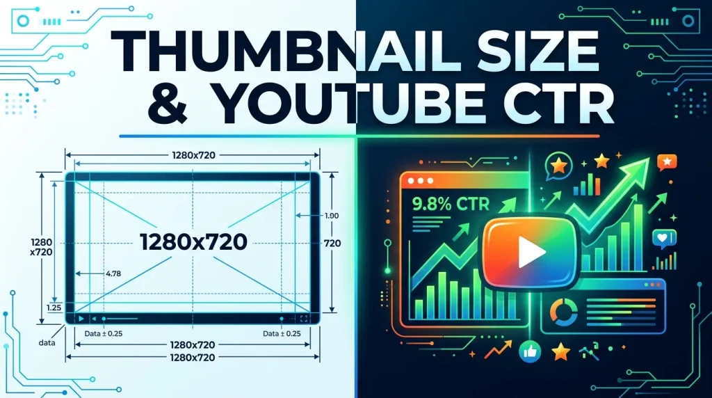
A technically perfect 1280 × 720 thumbnail can still receive few clicks if the design does not appeal to the target audience.
The purpose of correct dimensions is to make sure the thumbnail displays properly and remains sharp.
Click-through rate depends on many factors, including the video topic, title, audience, competition, thumbnail design, and how well the packaging matches what viewers want.
YouTube says viewers normally see the title and thumbnail before deciding whether to watch, which makes both elements important parts of how a video is presented.
So think of your thumbnail as part of your video’s overall presentation, not as an isolated image.
The Best YouTube Thumbnail Size: Quick Answer
If you only want the basic answer, use:
1280 × 720 pixels
16:9 aspect ratio
JPG or PNG
Keep the file size within YouTube’s current upload limit for your device
For creators who want to follow YouTube’s current higher-resolution recommendation, YouTube’s Help documentation lists 3840 × 2160 pixels with a minimum width of 640 pixels.
For most everyday thumbnail workflows, however, 1280 × 720 remains a convenient and widely used canvas.
Frequently Asked Questions
What is the exact YouTube thumbnail size?
For a standard horizontal YouTube video, 1280 × 720 pixels is the common working size, with a 16:9 aspect ratio. YouTube’s current Help documentation also recommends 3840 × 2160 pixels for custom thumbnails.
Is 1280 × 720 good for YouTube thumbnails?
Yes. It is a practical 16:9 working size and is widely used for standard YouTube thumbnail design.
Can I use 1920 × 1080 for a YouTube thumbnail?
Yes. It has the same 16:9 aspect ratio. A larger image can be used as long as it meets YouTube’s current upload requirements.
What format is best for a YouTube thumbnail?
JPG and PNG are both useful. JPG is often better for photographic thumbnails because it can provide good quality at a smaller file size. PNG can be useful for graphics, logos, and sharp text.
What size should YouTube Shorts thumbnails be?
Shorts use a vertical format, and YouTube recommends a 9:16 aspect ratio for Shorts.
How many words should a YouTube thumbnail have?
There is no official YouTube word limit. However, short text is usually easier to read. Three to five words can be a useful starting point, especially when designing for small screens.
Should I put my video title on the thumbnail?
Not necessarily. Your thumbnail and title should work together rather than simply repeating the same sentence. Use the thumbnail to highlight the most interesting part of the video’s idea.
Does a bigger thumbnail get more views?
No. Bigger dimensions alone do not guarantee more views. A thumbnail needs to be clear, relevant, visually appealing, and easy to understand.
Conclusion
Getting the YouTube thumbnail size right is easy once you know the basic specifications.
For a standard horizontal video, 1280 × 720 pixels and a 16:9 aspect ratio remain a simple and practical choice. You can also work at larger 16:9 resolutions, and YouTube’s current documentation recommends up to 3840 × 2160 pixels for custom thumbnails.
But remember that dimensions are only the starting point.
The best thumbnail is not necessarily the biggest one. It is the one that remains clear when it becomes small, communicates one strong idea, uses readable text, and gives viewers a reason to stop scrolling.
Keep your design simple, use high-quality images, avoid tiny text, maintain strong contrast, and always check how the thumbnail looks at a small size before publishing.
A technically correct thumbnail gets you ready for YouTube. A clear and compelling thumbnail gives viewers a reason to click.
2 thoughts on “YouTube Thumbnail Size: The Exact Dimensions That Actually Work”